SUMMER BRIEF
PRESENTATION
FEEDBACK
Today we presented our research to a small group, we were given 5 minutes to present our work to the group, at the end of the presentations people were given 1 minute to give feedback.
MY FEEDBACK RECIEVED:
-Good topic to research
-Maybe be a little more specific with what type you want to research, if you find one you like you may get really in to the reseach.
-Chose a broad topic but covered intersetingly and well.
-Can tell its a topic you enjoyed researching.
-Good branching out to find other designers.
-Maybe more info on the actual proccess... tools/machinary involved.
-Clear big pictures
-Could have more info
-Good that you know what you want to develop your own typography, so presentation is relevant to own practise.
-Good knowledge behind the designer
-Look in to print process
-How to present the type in print
-Good reason for research wanted to do
-Lots of visuals and info
-Good exploration of different aspects
-Could have narrowed it down or focussed on one or two areas as it is such a broad topic.
-Interesting subject.
-Try not to say 'stuff' too much.
-Could narrow research.
-Fascinating presentation, learnt about typographers that i had never heard of. Not only looking at the design but researched in to processes as well.
Next we were asked to evaluate our feedback and categorise it in to 3 areas. feedback that is useful, feedback that could be useful if elaborated on and ego boosting feedback.
Example of useful feedback:
-Maybe research more info on the actual proccess... tools/machinary involved
Example of feedback that could be useful:
-Could narrow research.
Example of feedback that just boosts ego:
-Good topic to research
From the feedback as a whole we were asked to come up with 3 objectives of how to improve the summer brief.
1. Try to narrow research so that i can have a more clear focussed direction.
2. Research in to the processes and techniques used by the artist.
3. Find other artists that i am interested in that are relevant to my topic.
Tuesday, 1 October 2013
Monday, 30 September 2013
Research 3: Anthony Burrill
SUMMER BRIEF
RESEARCH
ANTHONY BURRILL


Made By Hand for Wallpaper* from Anthony Burrill on Vimeo.
RESEARCH
ANTHONY BURRILL
I am particularly Interested in Anthony Burrill and his work. I like the simplisity and functionality of his work. I also like the way he uses traditional priniting methods such as screen printing and wood block type setting.
Graphic artist, print-maker and designer Anthony Burrill is known for his persuasive, up-beat style of communication. His work is held in the permanent collections of the Victoria and Albert Museum in London, the Cooper-Hewitt National Design Museum, New York and has been exhibited in galleries around the world including The Barbican, The Walker Art Centre and The Graphic Design Museum, Breda. In 2012, he made his first foray into curating with the exhibition Made in L.A. - Work by Colby Poster Printing, at KK Outlet in London.
Words and language are an important part of Burrill’s output and he has developed a distinctive voice that is sought after not only by collectors of his posters and prints but also by clients including Wallpaper* magazine, The Economist, The British Council, London Underground and The Design Museum. Burrill is perhaps best known for his typographic, text-based compositions, including the now-famous “Work Hard and Be Nice to People”, which has become a mantra for the design community and beyond.
Burrill has a long-standing relationship with the printers Adams of Rye where he uses traditional techniques to compose and print his work. The integrity lent to the process of image-making by hand-made methods is essential to his practice across all media — from print, to screen-based, to three-dimensional applications. In 2010 he worked with Happiness Brussels to design a screen-printed poster made with oil and sand collected from the beaches of the Gulf of Mexico disaster. Proceeds from the sale of the limited edition poster “Oil & Water Do Not Mix” went to CRCL (Coalition to Restore Coastal Louisiana) and copies were acquired by the V&A and Cooper-Hewitt for their collections.
While Burrill’s work is grounded in a serious devotion to his art, he has a lightness of touch and humour that, although often copied, is unique in the field of graphic communication. He frequently embarks on innovative collaborations with friends and fellow creatives. Recent and regular colluders include product designer Michael Marriott, writer and philosopher Alain de Botton, designer Ben Kelly and creative director Erik Kessels.
Installations, events and work in three dimensions punctuate Burrill’s practice. At the renowned annual graphic art fair Pick Me Up at Somerset House in London in 2011, Burrill re-located his studio to the gallery and held workshops and daily collaborations with fellow designers, illustrators, photographers and musicians over the course of ten days. For Graphic Design Worlds at the Triennale di Milano in 2011 Burrill and Michael Marriott built and installed a red-timbered chalet structure, clad with recreations of Burrill’s work cut from multi-veneer board.
As well as his self-authored work and commissioned design, Burrill makes regular appearances at events and talks worldwide. He also runs creative workshops attended by children, students and creative professionals alike. He documents and communicates his work and points of inspiration prolifically via social media, with thousands of followers on Twitter, Instagram and Tumblr.
Burrill was born in Littleborough, Lancashire. After studying Graphic Design at Leeds Polytechnic he completed an MA in Graphic Design at the Royal College of Art, London. He now lives and works on the Isle of Oxney, Kent.


Made By Hand for Wallpaper* from Anthony Burrill on Vimeo.
Research 2: Photography
SUMMER BRIEF


RESEARCH
PHOTOGRAPHY
one of my favourite hobbies is photography, it has always been an interest of mine but i became particularly involved when i studied A level photography. In particular i like architectural photography and portrates.
HISTORY:
The history of photography commenced with the invention and development of the camera and the creation of permanent images starting with Thomas Wedgwood in 1790 and culminating in the work of the French inventor Joseph Nicéphore Niépce in 1826.
Nicéphore Niépce's earliest surviving camera photograph, circa 1826: View from the Window at Le Gras (Saint-Loup-de-Varennes, France)
PIN HOLE CAMERA:
A pinhole camera is a simple camera without a lens and with a single small aperture – effectively a light-proof box with a small hole in one side. Light from a scene passes through this single point and projects an inverted image on the opposite side of the box. The human eye in bright light acts similarly, as do cameras using small apertures.
Up to a certain point, the smaller the hole, the sharper the image, but the dimmer the projected image. Optimally, the size of the aperture should be 1/100 or less of the distance between it and the projected image.
This is one technique that i did at college i really enjoyed it and found it interesting learning about how to use the chemicals in the dark room.

EXAMPLES:

HDR AND PANARAMICS:
High-dynamic-range imaging (HDRI or HDR) is a set of methods used in imaging and photography to capture a greater dynamic range between the lightest and darkest areas of an image than current standard digital imaging methods or photographic methods. HDR images can represent more accurately the range of intensity levels found in real scenes, from direct sunlight to faint starlight, and is often captured by way of a plurality of differently exposed pictures of the same subject matter.
A panorama is any wide-angle view or representation of a physical space, whether in painting,drawing, photography, film/video, or a three-dimensional model. photographers first began assembling multiple images of a view into a single wide image. In the late 19th century, panoramic cameras using curved film holders employed clockwork drives to scan a line image in an arc to create an image over almost 180 degrees. Digital photography of the late twentieth century greatly simplified this assembly process, which is now known as image stitching.
MY CAMERAS:
I currently have a canon 450d dslr camera and a canon ae1 35mm film camera. i have a variety of lenses for both cameras, my favourite being a wide angle lens for my film camera.
MY ARCHITECTUAL PHOTOGRAPHY:
NEW YORK:


LONDON:


MY PORTRATE PHOTOGRAPHY:


INSPIRATIONAL PHOTOGRAPHERS:
EZRA STOLLER:
Ezra Stoller (16 May 1915 – 29 October 2004) was an American architectural photographer.
Stoller was born in Chicago. His interest in photography began while he was an architecture student at New York University, when he began making lantern slides andphotographs of architectural models, drawings and sculpture. After his graduation in 1939, he concentrated on photography.
His work featured landmarks of modern architecture, including Ludwig Mies van der Rohe's Seagram Building, Frank Lloyd Wright's Fallingwater, Alvar Aalto's Finnish Pavilion at the 1939 New York World's Fair. Stoller is often cited in aiding the spread of the Modern Movement.
RICHARD STOW:
Richard’s work has seen him take in all aspects of the fashion and beauty industry for over a decade, gaining experience and expertise assisting many fashion and beauty photographers, including Clive Arrowsmith, Darren Feist, Nick Knight & Rankin. His images have been published in numerous international publications including L’Uomo Vogue, 125, U.S. Harper’s Bazaar, Stern, The Sunday Times Style, German Playboy, Schon!, Geil, U.K. & U.S. Elle, U.S. Marie Claire, Euroman, Q, Swarovski Rocks, Amica, Clash, and Spanish Vogue. Also directing moving image work, with music & fashion videos for indie and commercial clients & major labels, including the ‘Twilight: Eclipse’ OST, he now regularly collaborates on projects with clients such as Nicholas Kirkwood, Martyn Bal, Esprit, Wella, Warner music, Ellesse, Religion, Herbal Essences, Silvikrin, The Outnet, Almost Famous, Jean-Pierre Braganza, PRPS, Warehouse, & Sony, among many others. I really like the contrast between fashion photography and architectural photography in these shots.


Research 1: New York
SUMMER BRIEF
RESEARCH
NEW YORK
I visited New York in 2012 and fell in love with the culture and sights, because of this I have chosen to research it for my summer brief. From a graphic design point of view New York is obviously a beautiful city filled with art galleries and stunning architecture. But I am also interested in the way that the city has been branded (the big apple) and the connotations of a fresh, clean, healthy lifestyle that that intales.
I started my research by finding out general facts and figures about New York.
AREA:
New York city is situated on the east coast of the USA in the state of New York. It is made up of 5 boroughs Manhatten, The Bronx, Brooklyn, Queens and Staten Island.

DEMOGRAPHICS:
New York City is the most populous city in the United States, with an estimated record high of 8,336,697 residents as of 2012, incorporating more immigration into the city than outmigration since the 2010 United States Census. More people live in New York City than in the next two most populous U.S. cities Los Angeles and Chicago combined. The New York City metropolitan area is ethnically diverse. It is home to the largest Jewish community outside Israel. The metropolitan area is also home to 20% of the nation's Indian Americans and at least 20 Little India enclaves, as well as 15% of all Korean Americans and four Koreatowns; the largest Asian Indian population in the Western Hemisphere; the largest Russian American, Italian American, and African American populations; the largest South American and second-largest overall Hispanic communities in the United States; and includes 6 Chinatowns in New York City alone.


RESEARCH
NEW YORK
I visited New York in 2012 and fell in love with the culture and sights, because of this I have chosen to research it for my summer brief. From a graphic design point of view New York is obviously a beautiful city filled with art galleries and stunning architecture. But I am also interested in the way that the city has been branded (the big apple) and the connotations of a fresh, clean, healthy lifestyle that that intales.
I started my research by finding out general facts and figures about New York.
AREA:
New York city is situated on the east coast of the USA in the state of New York. It is made up of 5 boroughs Manhatten, The Bronx, Brooklyn, Queens and Staten Island.
DEMOGRAPHICS:
New York City is the most populous city in the United States, with an estimated record high of 8,336,697 residents as of 2012, incorporating more immigration into the city than outmigration since the 2010 United States Census. More people live in New York City than in the next two most populous U.S. cities Los Angeles and Chicago combined. The New York City metropolitan area is ethnically diverse. It is home to the largest Jewish community outside Israel. The metropolitan area is also home to 20% of the nation's Indian Americans and at least 20 Little India enclaves, as well as 15% of all Korean Americans and four Koreatowns; the largest Asian Indian population in the Western Hemisphere; the largest Russian American, Italian American, and African American populations; the largest South American and second-largest overall Hispanic communities in the United States; and includes 6 Chinatowns in New York City alone.
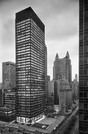
ARCITECTURE:
With a mixture of both modernist and art deco architecture in New York, the skyline is facinating juxtaposing clean crisp lines with embelished elaborate buildings.
Modernist:
The Seagram Building is a skyscraper, located at 375 Park Avenue, between 52nd Street and 53rd Street in Midtown Manhattan, New York City. The structure was designed by German architect Ludwig Mies van der Rohe while the lobby and other internal aspects were designed by Philip Johnson including The Four Seasons and Brasserie restaurants. Severud Associates were the structural engineering consultants. The building stands 515 feet (157 m) tall with 38 stories, and was completed in 1958. It stands as one of the finest examples of thefunctionalist aesthetic and a masterpiece of corporate modernism.
Art Deco:
The Chrysler Building is an Art Deco style skyscraper in New York City, located on the east side of Manhattan in the Turtle Bay area at the intersection of 42nd Street and Lexington Avenue. At 1,046 feet (319 m), the structure was the world's tallest building for 11 months before it was surpassed by the Empire State Building in 1931. It is still the tallest brick building in the world, albeit with an internal steel skeleton. After the destruction of the World Trade Center, it was again the second-tallest building in New York City until December 2007, when the spire was raised on the 1,200-foot (365.8 m) Bank of America Tower, pushing the Chrysler Building into third position. In addition,The New York Times Building, which opened in 2007, is exactly level with the Chrysler Building in height. Both buildings were then pushed into 4th position, when the under construction One World Trade Center surpassed their height.
Whilst I was in new york I went to the MoMA, not only was I impressed by the art exhibitions I also loved the clean crisp modernist architecture. Here are a selection of my own photography.


NEW YORK DESIGN STUDIOS:
Sagmeister and walsh

"Sagmeister & Walsh is a NYC based design firm that creates identities, commercials, websites, apps, films, books and objects for clients, audiences and ourselves"


NEW YORK IN DESIGN:


Subscribe to:
Posts (Atom)